Visit Looe
Font and brand
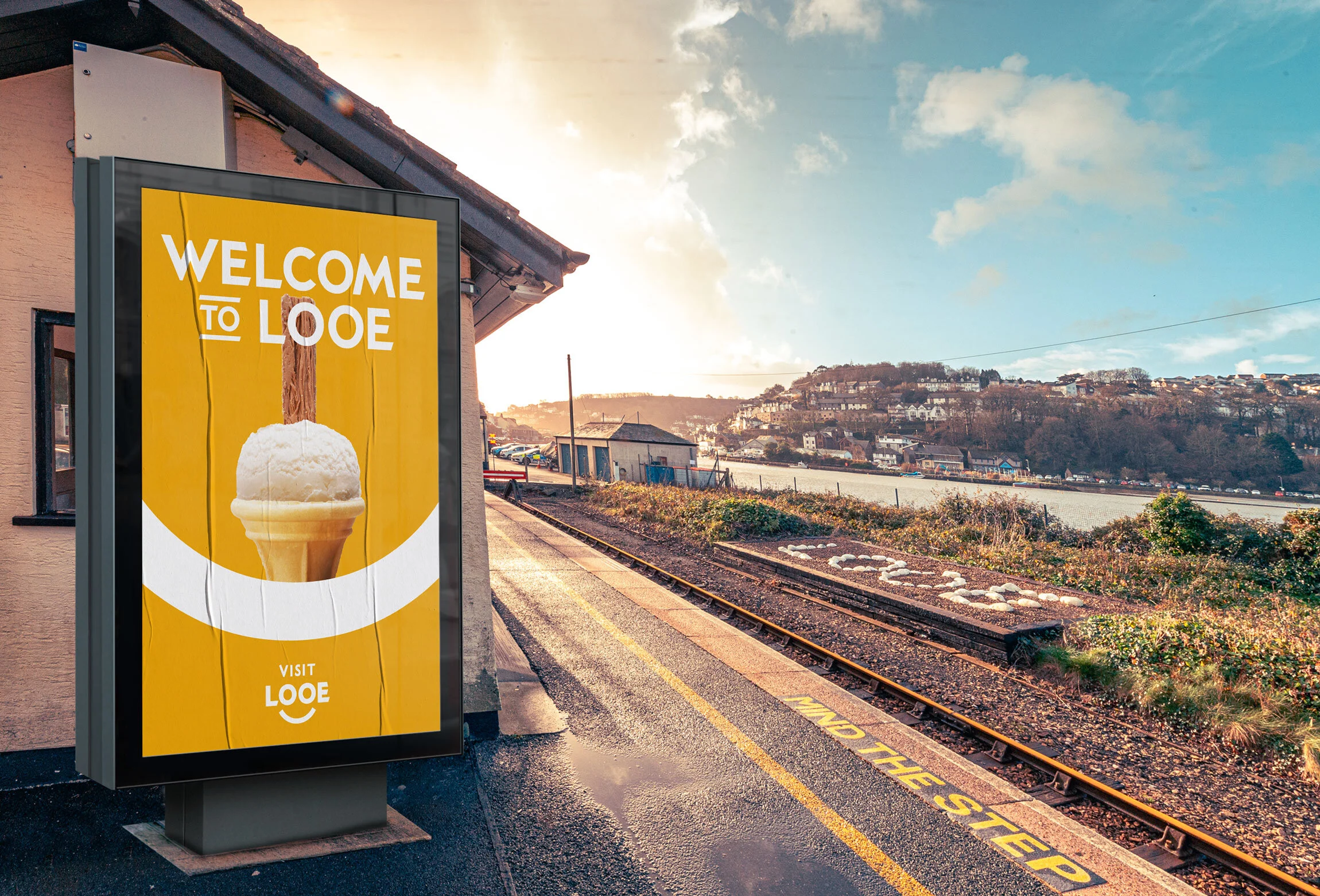
That time we cut a bespoke font and branded a town! Looe Town Council were relaunching the Visit Looe website but needed a new identity. As a local lad brought up a pasty’s throw from Looe Beach, this was Nick Dell ‘Anno’s dream job.
Brief: portray the town in a fresh light to residents, visitors and outside investment. Look to the future, be current and work harder online.
The design, colours and fonts reflect Looe’s traditions and history, whilst still creating a fresh, contemporary feel that places it as a relevant destination of choice.

Bespoke font for Looe in Cornwall

Inspired by the 1930s Great Western Railway branding, we created a bespoke typeface, unique to Looe. They now own their new look.

‘Modern and clean...A place that is serious about bringing people to their area.’
— Great Western Rail